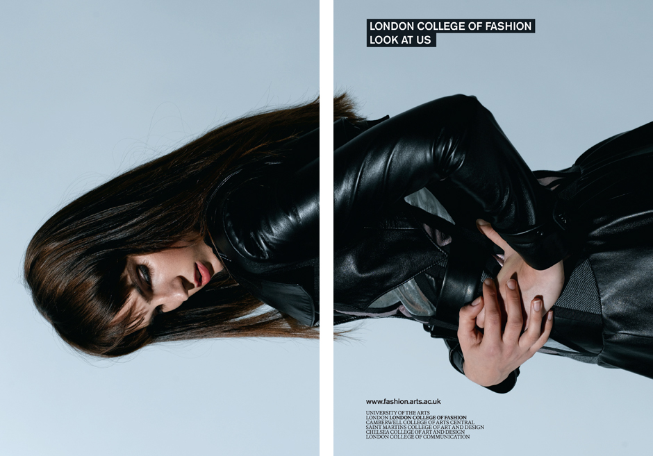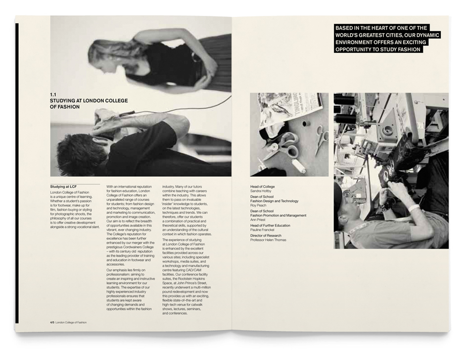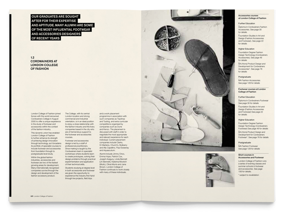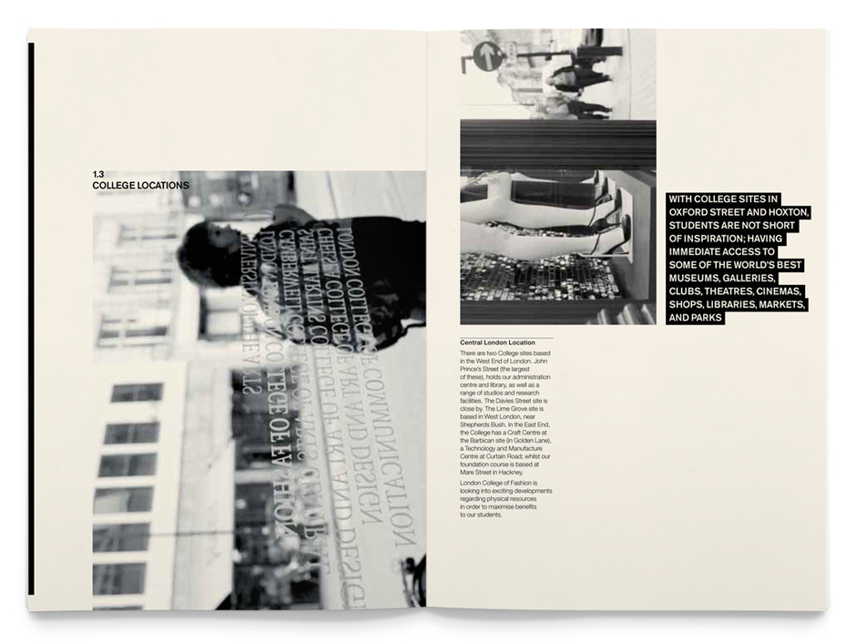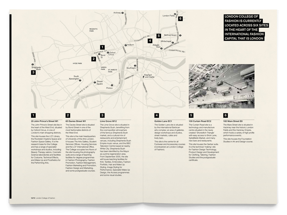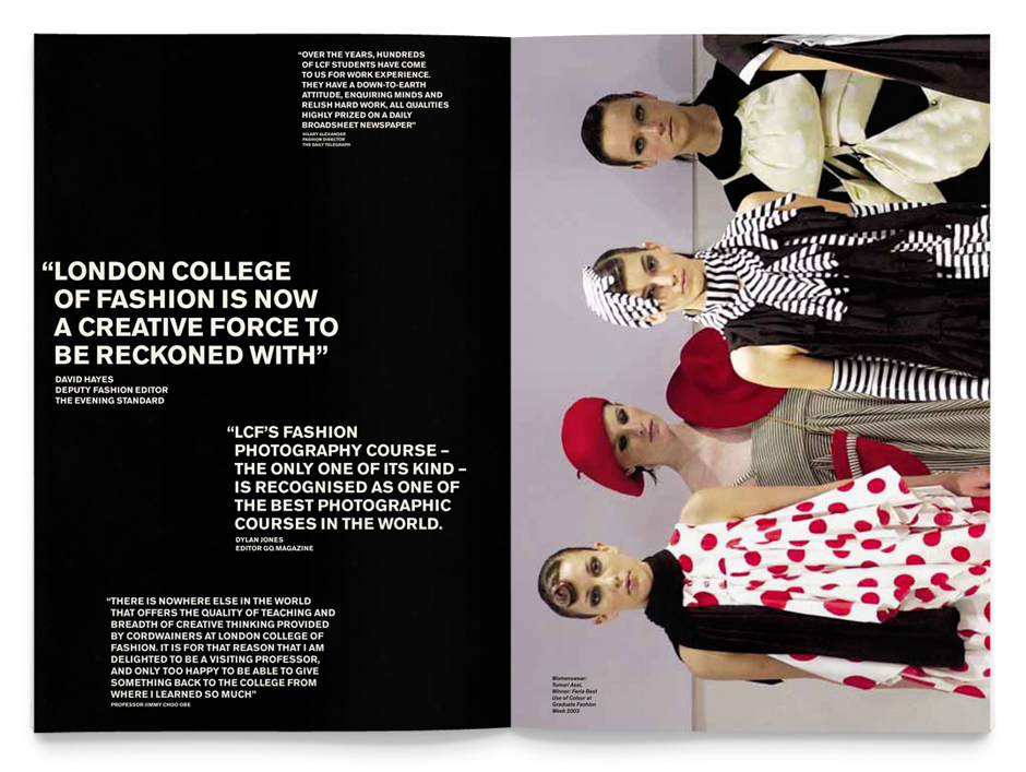


We had been designing prospectuses for London College of Fashion (LCF) for two years – one for the College, two for its development unit which delivers short and summer courses, and one for international students. This year our brief was to express the character of this creative and practice-based fashion College with an idea that would work across all the prospectuses, and appeal to all audiences. Words on the horizontal (warp) and pictures on the vertical (weft) are interwoven to form the ‘fabric’ of every prospectus. In this way, they are all endowed with personality, pace and distinctive style. Clear typography and colour-coding make for well organised content (no matter how detailed) and easy navigation. And consistency of size and format makes for a cohesive collection.
